Extension manifest
Section titled “Extension manifest”Starting with WebUI 3.1, every extension must include a manifest declaring its compatibility and metadata. When you use Scan for extensions in Settings → Interface → Extra content, the WebUI reads the manifest for each extension file. The manifest can be inside the extension HTML (recommended) or in an external JSON file (fallback).
Embedded manifest (recommended)
Section titled “Embedded manifest (recommended)”Put the manifest inside your extension HTML so code and metadata stay in one file. Add a <script> block with id="esp3dext-manifest" and type="application/json":
<script type="application/json" id="esp3dext-manifest">{ "name": "My Extension", "owner": "MyName", "version": "1.0.0", "github": "https://github.com/...", "description": "What this extension does.", "icon": "Tool", "target": "panel", "refreshtime": "0", "supportedVersion": "3.*", "targetSystem": "*"}</script>The WebUI fetches the extension file and looks for this block first. If found, it uses it and does not request a separate .json file.
External sidecar manifest (fallback)
Section titled “External sidecar manifest (fallback)”If no embedded manifest is found, the WebUI looks for a JSON file with the same base name as the extension file (e.g. esp3dext-myplugin.json for esp3dext-myplugin.html).
- Location: Same directory as the extension
.html/.html.gzfile. - Name: Same base name,
.jsonextension.
Manifest format
Section titled “Manifest format”| Field | Required | Description |
|---|---|---|
name | Yes | Display name of the extension in the UI. |
target | Yes | Placement: panel, page, or content. |
supportedVersion | Yes | WebUI version pattern. * = any version; 3.* = any 3.x; 3.1.* = any 3.1.x. |
targetSystem | Yes | Target filter: * (all), 3d printer, cnc, sand table, marlin, grbl, grblhal. Multiple values: "3d printer, cnc". |
owner | No | Author name. |
version | No | Extension version (e.g. "1.0.0"). |
github | No | Repository or homepage URL. |
description | No | Short description. |
icon | No | Icon ID from the WebUI icon set. Default: "Meh". |
refreshtime | No | Refresh interval in ms, or "0" for no refresh. |
If the manifest is missing, invalid, or lacks any required field, the extension is shown as Unsupported. If supportedVersion or targetSystem does not match the current WebUI version or target, the extension is not added by the scan.
See the Extensions documentation for more details on file naming, scan behaviour, and installation.
- Basic code
- Send message
- Send GCODE command or ESP command
- Send web query
- Send web upload
- Send webdownload request
- Send sound notification
- Send toast notification
- Send translation request
- Send capabilities request
- Save extension settings to preferences.json
- Send icon request
- Dispatch message to other extensions
- Modal Dialog Documentation
- Sample codes
Basic code
Section titled “Basic code”Here is basic code for an extension to communicate with the Web UI.
<script type="text/javascript">
//Send message to web uifunction sendMessage(msg){    window.parent.postMessage(msg, '*');}
//Process Message coming from webUIfunction processMessage(eventMsg){    //now process eventMsg.data}
//Setup message listener from webUIwindow.onload = (event) => {  window.addEventListener("message", processMessage, false);};
</script>
<div class="container">Display your HTML here</div>
As you can see, the code is minimal. It can fit either a panel or a page. WebUI CSS/theme is added by WebUI after loading, so you do not need to add any styles. You can use any existing class available in WebUI.
Communication between the frame and the main window is done through messages using objects (string/array based). Do not use any object that cannot be cloned, or loading will fail.
One typical use case is when WebUI sends notifications to an extension to indicate whether it is visible, so the extension can adjust its behavior accordingly.
The notification message (eventMsg.data) has the following structure:
{ type: 'notification', content: { isVisible: true | false, }, id: 'extra_content_XXXXX'}The id is the ID of the node that contains the iframe. Unlike other messages, a notification with a specific ID is addressed to the iframe of that node and is not broadcast to all iframes. If no ID is provided, the ID will be all.
Currently notifications are limited to isVisible and isConnected, but it is possible to add more notifications in the future.
Here is an example of an extension that displays all notifications in a list:
<script type="text/javascript">let output = ""//Process Message coming from webUIfunction processMessage(eventMsg){    //now process eventMsg.data    if (eventMsg.data.type && eventMsg.data.type == "notification"){        if (eventMsg.data.content){            if (typeof eventMsg.data.content.isVisible != 'undefined'){                output+="Visible:" + eventMsg.data.content.isVisible + "\n";                }            if (typeof eventMsg.data.content.isConnected != 'undefined'){                output+="Connected:" + eventMsg.data.content.isConnected + "\n";                }            document.getElementById("notificationsApi").innerHTML=  output;        }    }}//Setup message listener from webUIwindow.onload = (event) => {  window.addEventListener("message", processMessage, false);};</script>
<div class="container"><pre id="notificationsApi"></pre></div>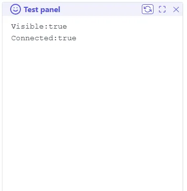
Send message
Section titled “Send message”The message structure used by window.parent.postMessage(msg, '*'); has a defined format: some parameters are mandatory, some are optional, and some depend on the message type:
\{type:'<message type>', target:'webui', id:'[origin]', noDispatch:[true], XXX:YYY\}
<message type> is mandatory, it defines the purpose of the message
target:'webui' is mandatory, it helps filter the message
id:'[origin]' is optional; it defines which ID should read the response, if any. If present, it can be used by the extension to filter messages. No ID means the message is for everyone
noDispatch:[true] is optional; if true, it prevents sending an answer, if any. If omitted or set to false, it sends an answer message, if any
XXX:YYY is optional or mandatory depending on the message type
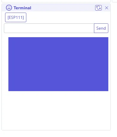
Send GCODE command or ESP command
Section titled “Send GCODE command or ESP command”Example: \{type:'cmd', target:'webui',id:'terminal', content:'[ESP111]'\}
type is cmd (mandatory)
target is webui (mandatory)
id is terminal (optional)
content is the command that needs to be sent, in this case [ESP111] (mandatory)
Note: there is no noDispatch:true, so any answer from ESP firmware will be sent.
Note 2: there is no way to prevent the answer from being broadcast if it comes from an external board over serial, even if id and noDispatch are set.
-
Answer format: check the
eventMsg.data-
if success
{"type": "cmd","content": {"status": "success""response": "192.168.1.111","initiator": {"content":"[ESP111]","id":"terminal","target":"webui","type":"cmd",}},"id": "terminal"}type is
cmd
id is the id set in command message to help to screen
content has the response’s status which issuccess, the response itself response, in our case192.168.1.111and also the initiator is the initial command for reference -
if error
{"type": "cmd","content": {"status": "error","error":"Cannot connect","initiator": {"content":"[ESP111]","id":"terminal","target":"webui","type":"cmd",}},"id":"terminal"}type is
errorfor any error command
id is the id set in command message to help to screen
content has the response’s status which iserror, and the error itself error, in our caseCannot connectand also the initiator is the initial command for reference
-
Send web query
Section titled “Send web query”Example: \{type:'query', target:'webui', id:'filemanager', url:'files', args:\{action:'list', path:'/'\}\}
type is query (mandatory)
target is webui (mandatory)
id is terminal (optional)
url is the base url in our case files for /files (mandatory)
args is the set of URL arguments, in this case \{action:'list', path:'/'\} for /files?action=list&path=/ (optional for query)
Note: noDispatch:true and id:'term' are applicable in this case if needed
- Answer format: check the
eventMsg.data-
if success
{"type": "query","response": {"status": "success","response": "{\"files\":[{\"name\":\"config.yaml\",\"size\":\"1.55 KB\"}],\"path\":\"/\",\"occupation\":\"35\",\"status\":\"ok\",\"total\":\"1.31 MB\",\"used\":\"470.08 KB\"}","initiator": {"type": "query","target": "webui","id": "filemanager","url": "files","args": {"action": "list","path": "/"}}},"id": "filemanager"}type is
query
id is the id set in output message to help to screen
content has the response’s status which issuccess, the response itself response, in our case a JSON, and also the initiator is the initial command for reference -
if error
{"type": "query","response": {"status": "error","error": "Cannot connect","initiator": {"type": "query","target": "webui","id": "filemanager","url": "files","args": {"action": "list","path": "/"}}},"id": "filemanager"}type is
query
id is the id set in output message to help to screen
content has the response’s status which iserror, and the error itself error, in our caseCannot connectand also the initiator is the initial command for reference
-
Send web upload
Section titled “Send web upload”Example:
\{type:'upload', target:'webui', id:'filemanager', url:'files', content:[...],size:500, path:"/", filename:'file.txt'\}
type is upload (mandatory)
target is webui (mandatory)
id is filemanager (optional)
url is the base url in our case files for /files (mandatory for upload)
content is the file as an array object (mandatory)
size is the file size (mandatory)
path is the file target path (not including name) (mandatory)
filename is the file name (without path) (mandatory)
args is an object with optional arguments as in query; they are not used in POST body but in the URL itself
Note: noDispatch:true and id:'filemanager' are applicable in this case if needed
- Answer format: check the
eventMsg.data
For upload, the initiator does not contain the file content.-
if success
{"type": "upload","response": {"status": "success","response": "{\"files\":[{\"name\":\"config.yaml\",\"size\":\"1.55 KB\"},{\"name\":\"file.txt\",\"size\":\"500B\"}],\"path\":\"/\",\"occupation\":\"35\",\"status\":\"ok\",\"total\":\"1.31 MB\",\"used\":\"470.08 KB\"}","initiator": {"type":"upload","target":"webui","id":"filemanager","url":"files","size":500,"path":"/","filename":"file.txt"}},"id": "filemanager"}type is
upload
id is the id set in output message to help to screen
content has the response’s status which issuccess, the response itself response, in our case a JSON, and also the initiator is the initial command for reference but without the file content -
progression message
{"type": "upload","response": {"status": "progress","progress": "100","initiator": {"type":"upload","target":"webui","id":"filemanager","url":"files","size":500,"path":"/","filename":"file.txt"}},"id": "filemanager"}type is
upload
id is the id set in output message to help to screen
content has the response’s status which isprogress, and the progress itself progress, in our case100= 100% and also the initiator is the initial command for reference but without the file content -
if error
{"type": "upload","response": {"status": "error","error": "Cannot connect","initiator": {"type":"upload","target":"webui","id":"filemanager","url":"files","size":500,"path":"/","filename":"file.txt"}},"id": "filemanager"}type is
upload
id is the id set in output message to help to screen
content has the response’s status which iserror, and the error itself error, in our caseCannot connectand also the initiator is the initial command for reference but without the file content
-
Send web download request
Section titled “Send web download request”Example:
\{type:'download', target:'webui', id:'filemanager', url:'preferences.json'\}
type is download (mandatory)
target is webui (mandatory)
id is filemanager (optional)
url is the URL of the file, in this case preferences.json for /preferences.json (mandatory)
args is an object with optional arguments like for query
Note: id:'filemanager' is applicable in this case if needed, but not noDispatch:true as the purpose is to get response
- Answer format: check the
eventMsg.data-
if success
{"type": "download","response": {"status": "success","response": [...],"initiator": {"type":"download","target":"webui","id":"filemanager","url":"preferences.json",}},"id": "filemanager"}
-
type is download
id is the id set in output message to help to screen
content has the response status (success), the response itself (response) - in this case a blob that must be read properly - and the initiator (the initial command for reference)
-
progression message
{"type": "download","response": {"status": "progress","progress": "100","initiator": {"type":"download","target":"webui","id":"filemanager","url":"preferences.json",}},"id": "filemanager"}type is
download
id is the id set in output message to help to screen
content has the response’s status which isprogress, and the progress itself progress, in our case100= 100% and also the initiator is the initial command for reference -
if error
{"type": "download","response": {"status": "error","error": "404","initiator": {"type":"download","target":"webui","id":"filemanager","url":"preferences.json",}},"id": "filemanager"}type is
download
id is the id set in output message to help to screen
content has the response’s status which iserror, and the error itself error, in our case404(file not found) and also the initiator is the initial command for reference
Send sound notification
Section titled “Send sound notification”There is no answer for this message, so id is not required.
-
Generate a beep notification
Example:
\{type:'sound', target:'webui', content:'beep'\}type is
sound(mandatory)
target iswebui(mandatory)
sound is the sound type, in our casebeep(mandatory) -
Generate a beep error notification
Example:
\{type:'sound', target:'webui', content:'error'\}type is
sound(mandatory)
target iswebui(mandatory)
sound is the sound type, in our caseerror(mandatory) -
Generate a beep sequence notification
Example:
\{type:'sound', target:'webui', content:'beep', seq:[\{ f: 1046, d: 200 \},\{ f: 1318, d: 100 \}]\}type is
sound(mandatory)
target iswebui(mandatory)
sound is the sound type, in our caseseq(mandatory)
seq is an array of beep sequences, in this case[\{ f: 1046, d: 200 \},\{ f: 1318, d: 100 \}](mandatory).fis frequency anddis beep duration
Send toast notification
Section titled “Send toast notification”There is no answer for this message, so id is not required.
-
Generate a success toast notification
Example:
\{type:'toast', target:'webui', content:\{text:'This is a success', type:'success'\}\}type is
toast(mandatory)
target iswebui(mandatory)
content has the toast type, in our casesuccess, and the text to display, in our caseThis is a success(mandatory) -
Generate an error toast notification
Example:
\{type:'toast', target:'webui', content:\{text:'This is an error', type:'error'\}\}type is
toast(mandatory)
target iswebui(mandatory)
content has the toast type, in our caseerror, and the text to display, in our caseThis is an error(mandatory) -
Generate a normal toast notification
Example:
\{type:'toast', target:'webui', content:\{text:'This is a toast', type:'default'\}\}
type istoast(mandatory)
target iswebui(mandatory)
content has the toast type, in our casedefault, and the text to display, in our caseThis is a toast(mandatory)
Send translation request
Section titled “Send translation request”-
Simple translation Example:
\{type:'translate', target:'webui', id:'transpanel', content:'S153'\}type is
translate(mandatory)
target iswebui(mandatory)
id istranspanel(optional)
content is the text that needs to be translated, in this caseS153(mandatory)-
Answer format: check the
eventMsg.data{"type": "translate","content": {"response": "Your session will end soon, do you want to stay connected ?","initiator": {"type":"translate","target":"webui","id":"transpanel","content":"S153"}},"id": "transpanel"}type is
translate
id is the id set in command message to help to screen
content has the response itself response, in our caseYour session will end soon, do you want to stay connected ?and also the initiator is the initial command for reference
-
-
Full dump of translations
Example:
\{type:'translate', target:'webui', id:'transpanel', all:'true'\}type is
translate(mandatory)
target iswebui(mandatory)
id istranspanel(optional)
all to take all translations (mandatory)-
Answer format: check the
eventMsg.data{"type": "translate","content": {"response": "Your session will end soon, do you want to stay connected ?","initiator": {"type":"translate","target":"webui","id":"transpanel","content":[....]}},"id": "transpanel"}type is
translate
id is the id set in command message to help to screen
content has the response itself response, in our case an array of all translations and also the initiator is the initial command for reference
-
Send capabilities request
Section titled “Send capabilities request”This allows you to collect all capabilities for a specific topic:
- if id is
connectionyou will get the json of [ESP800] response jsonified - if id is
featuresyou will get the [ESP400] response jsonified - if id is
interfaceyou will get the settings from preferences.json jsonified - if id is
settingsyou will get specific settings from target fw in json format - if id is
extensionsyou will get the extensions from preferences.json jsonified of thenameextensions
Note: this API only collects existing data. So for features, interface, extensions, and settings, you may get an empty response if the corresponding query has not been done.
For settings, the format may differ from one firmware to another, so you need to check the response to know how to use it. The response is always a variable named machineSettings, and important content is usually located in machineSettings.cache.
Example:
\{type:'capabilities', target:'webui', id:'connection'\}
type is capabilities (mandatory)
target is webui (mandatory)
id is connection (mandatory)
-
Answer format: check the
eventMsg.data{"type": "capabilities","content": {"response": "{"FWVersion": "3.0.0.a111","FWTarget": "marlin","FWTargetID": "40","Setup": "Enabled","Screen": "HMI V3","Streaming": "Enabled","SDConnection": "direct","SerialProtocol": "Raw","Authentication": "Disabled","WebCommunication": "Asynchronous","WebSocketIP": "localhost","WebSocketPort": "81","Hostname": "esp3d","WiFiMode": "STA","WebUpdate": "Enabled","FlashFileSystem": "LittleFS","HostPath": "/","Time": "none","HostTarget": "files","HostUploadPath": "/","HostDownloadPath": "/","wsID": "0"}","initiator": {"type":"capabilities","target":"webui","id":"connection"}},"id": "connection"}type is
capabilities
id is the id of requested capability
content has the response itself response, in our case a JSON and also the initiator is the initial command for reference
Save extension settings to preferences.json
Section titled “Save extension settings to preferences.json”This allows you to save extension settings to preferences.json. It is a way to store extension settings for the next session:
Example:
\{type:'extensionsData', target:'webui', id:'myextension', content:'\{"setting1":"value1","setting2":"value2"\}'\}
type is extensionsData (mandatory)
target is webui (mandatory)
id is myextension (mandatory)
content is the settings to save, in stringified JSON format, in our case \{"setting1":"value1","setting2":"value2"\} (mandatory)
-
Answer format: check the
eventMsg.data{"type": "extensionsData","content": {"response": "{"status": "success"}","initiator": {"type":"extensionsData","target":"webui","id":"myextension","content":"{"setting1":"value1","setting2":"value2"}"}},"id": "myextension"}type is
extensionsData
id is the id of extension that saved settings
content has the response which is the status and also the initiator is the initial command for reference
Send icon request
Section titled “Send icon request”WebUI already includes a set of icons, so you do not need to add new ones. You can request a specific icon if needed.
Note: some icons may be specific to a system, so they may not be available everywhere. The SVG icon is returned in the response using quotes in the SVG tag, so be sure to use it properly.
Main icons are:
None: null,Activity: <Activity />,AlertCircle: <AlertCircle />,Anchor: <Anchor />,Aperture: <Aperture />,Award: <Award />,BarChart: <BarChart />,BellOff: <BellOff />,Bell: <Bell />,Bluetooth: <Bluetooth />,Bookmark: <Bookmark />,Box: <Box />,Camera: <Camera />,Cast: <Cast />,ChevronDown: <ChevronDown />,ChevronLeft: <ChevronLeft />,ChevronRight: <ChevronRight />,ChevronUp: <ChevronUp />,ChevronsDown: <ChevronsDown />,ChevronsLeft: <ChevronsLeft />,ChevronsRight: <ChevronsRight />,ChevronsUp: <ChevronsUp />,Clipboard: <Clipboard />,Clock: <Clock />,Cpu: <Cpu />,Crosshair: <Crosshair />,Database: <Database />,Delete: <Delete />,Download: <Download />,Droplet: <Droplet />,Edit: <Edit />,EyeOff: <EyeOff />,Eye: <Eye />,File: <File />,Filter: <Filter />,Flag: <Flag />,Frown: <Frown />,GitCommit: <GitCommit />,Globe: <Globe />,Grid: <Grid />,HardDrive: <HardDrive />,Hash: <Hash />,Heart: <Heart />,HelpCircle: <HelpCircle />,Home: <Home />,Image: <Image />,Info: <Info />,Layers: <Layers />,LifeBuoy: <LifeBuoy />,List: <List />,Loader: <Loader />,Lock: <Lock />,LogIn: <LogIn />,LogOut: <LogOut />,Mail: <Mail />,MapPin: <MapPin />,Meh: <Meh />,Menu: <Menu />,MessageSquare: <MessageSquare />,MinusCircle: <MinusCircle />,Monitor: <Monitor />,Moon: <Moon />,MoreHorizontal: <MoreHorizontal />,MoreVertical: <MoreVertical />,Move: <Move />,PauseCircle: <PauseCircle />,Percent: <Percent />,PlayCircle: <PlayCircle />,PlusCircle: <PlusCircle />,Power: <Power />,Printer: <Printer />,Radio: <Radio />,RefreshCw: <RefreshCw />,Repeat: <Repeat />,RotateCcw: <RotateCcw />,Save: <Save />,Scissors: <Scissors />,Send: <Send />,Server: <Server />,Settings: <Settings />,Share: <Share />,Slash: <Slash />,Sliders: <Sliders />,Smile: <Smile />,Star: <Star />,StopCircle: <StopCircle />,Sun: <Sun />,Sunrise: <Sunrise />,Sunset: <Sunset />,Tag: <Tag />,Target: <Target />,Terminal: <Terminal />,Thermometer: <Thermometer />,Tool: <Tool />,Trash2: <Trash2 />,Underline: <Underline />,Upload: <Upload />,VideoOff: <VideoOff />,Video: <Video />,VolumeX: <VolumeX />,Volume: <Volume />,WifiOff: <WifiOff />,Wifi: <Wifi />,Wind: <Wind />,XCircle: <XCircle />,ZapOff: <ZapOff />,Zap: <Zap />,3D printers have in addition:
Fan,FeedRate,FlowRate,ExtruderCNC has in addition :
Fan,FeedRate,FlowRate,Example:
\{type:'icon', target:'webui', id:'Activity'\}
type is icon (mandatory)
target is webui (mandatory)
id is Activity (mandatory)
-
Answer format: check the
eventMsg.data{"type": "icon","content": {"response": "<svg xmlns='http://www.w3.org/2000/svg' width='24' height='24' viewBox='0 0 24 24' fill='none' stroke='currentColor' stroke-width='2' stroke-linecap='round' stroke-linejoin='round'><path d='M13 2H6a2 2 0 0 0-2 2v16a2 2 0 0 0 2 2h12a2 2 0 0 0 2-2V9z'></path><polyline points='13 2 13 9 20 9'></polyline></svg>","initiator": {"type": "icon","target": "webui","id": "Activity"}},"id": "Activity"}type is
icon
id is the id of requested “Activity”
content has the response itself response, in our case svg using quote , also the initiator is the initial command for reference
Dispatch message to other extensions
Section titled “Dispatch message to other extensions”Example:
{ type:'dispatch', target:'webui', id:'senderpanel', content:'any message' , targetid:'receiverpanel'}type is dispatch (mandatory)
target is webui (mandatory)
id is senderpanel (optional)
content the message to dispatch
Note: there is no answer because the purpose is to dispatch a message.
Modal Dialog Documentation
Section titled “Modal Dialog Documentation”This documentation describes how to use the modal dialog functionality. The modal dialog is a pop-up window that displays a message to the user and requires the user to respond before they can continue. The modal dialog can be used to display simple messages, confirmations, input fields, and multiple input fields.
Modal Types
Section titled “Modal Types”The code supports four types of modal dialogs:
- Simple Modal: Displays a basic modal with a title, text, and a single button.
- Confirmation Modal: Displays a modal with a title, text, and two buttons for confirmation.
- Input Modal: Displays a modal with a title, text, an input field, and two buttons.
- Fields Modal: Displays a modal with a title, multiple input fields, and two buttons.
Sending Messages
Section titled “Sending Messages”To open a modal dialog, you need to send a message to the parent window using the sendMessage function. The message should have the following structure:
sendMessage({ type: 'modal', target: 'webui', id: 'modalpanel', content: { // Modal-specific content }});- type: Always set to ‘modal’.
- target: Always set to ‘webui’.
- id: Set to ‘modalpanel’ for all modal types.
- content: An object containing the modal-specific content.
Modal Content
Section titled “Modal Content”Each modal type has its own specific content structure:
- Simple Modal
Example:
{ type:'modal', target:'webui', id:'modalpanel', content: { title:'This is title', id:'simple_modal', style:'default', bt1Txt:'S126', response1:'ok', text:'some text', overlay:true }}- type (mandatory): ‘modal’
- target (mandatory): ‘webui’
- id (optional): ‘modalpanel’
- content (mandatory): Modal description
- title (mandatory): Title of the modal. Use predefined text for translation.
- id (mandatory): Modal ID. Example: ‘simple_modal’
- style (mandatory): Modal style. For simple modal, use ‘default’.
- bt1Txt (optional): Text for button 1. ‘S126’ will be translated as ‘Ok’. If not defined, the button won’t be displayed.
- response1 (optional): Message sent if button 1 is clicked. Example: ‘ok’. The click closes the modal.
- bt2Txt (optional): Text for button 2. If not defined, the button won’t be displayed.
- response2 (optional): Message sent if button 2 is clicked. The click closes the modal.
- hideclose (optional): If set to true, it hides the close button of the modal.
- overlay (optional): If set to true, it automatically closes the modal if it loses focus.
- text (optional): Text to display in the modal. If it’s a predefined text, it will be translated.
Note: The close button and overlay feature won’t send any notification when the modal is closed.
Answer format: Check eventMsg.data
{ "type": "modal", "content": { "response": "ok", "initiator": { "type": "modal", "target": "webui", "id": "modalpanel", "content": { "title": "This is title", "id": "simple_modal", "style": "default", "bt1Txt": "S126", "response1": "ok", "text": "some text", "overlay": true } } }, "id": "modalpanel"}- type: ‘modal’
- id: ID set in the command message to help with screening
- content: Contains the response itself (response) and the initiator (initial command for reference)
- Confirmation Modal Example:
{ type:'modal', target:'webui', id:'modalpanel', content: { title:'S26', id:'confirm_modal', style:'question', bt1Txt:'S27', response1:'yes', bt2Txt:'S28', response2:'cancel', text:'S30', hideclose:true }}- type (mandatory): ‘modal’
- target (mandatory): ‘webui’
- id (optional): ‘modalpanel’
- content (mandatory): Modal description
- title (mandatory): Title of the modal. ‘S26’ will be translated as ‘Please Confirm’.
- id (mandatory): Modal ID. Example: ‘confirm_modal’
- style (mandatory): Modal style. For confirmation modal, use ‘question’.
- bt1Txt (optional): Text for button 1. ‘S27’ will be translated as ‘Yes’. If not defined, the button won’t be displayed.
- response1 (optional): Message sent if button 1 is clicked. Example: ‘yes’. The click closes the modal.
- bt2Txt (optional): Text for button 2. ‘S28’ will be translated as ‘Cancel’. If not defined, the button won’t be displayed.
- response2 (optional): Message sent if button 2 is clicked. Example: ‘cancel’. The click closes the modal.
- hideclose (optional): If set to true, it hides the close button of the modal.
- overlay (optional): If set to true, it automatically closes the modal if it loses focus.
- text (optional): Text to display in the modal. ‘S30’ will be translated as ‘Do you want to update?’.
Note: The close button and overlay feature won’t send any notification when the modal is closed.
Answer format: Check eventMsg.data
{ "type": "modal", "content": { "response": "yes", "initiator": { "type": "modal", "target": "webui", "id": "modalpanel", "content": { "title": "S26", "id": "confirm_modal", "style": "question", "bt1Txt": "S27", "response1": "yes", "bt2Txt": "S28", "response2": "cancel", "text": "S30", "hideclose": true } } }, "id": "modalpanel"}- type: ‘modal’
- id: ID set in the command message to help with screening
- content: Contains the response itself (response) and the initiator (initial command for reference)
- Input Modal Example:
{ type:'modal', target:'webui', id:'modalpanel', content: { title:'S90', id:'input_modal', style:'input', validation:'bt1', bt1Txt:'S106', response1:'create', bt2Txt:'S28', response2:'cancel', text:'S104', hideclose:true }}- type (mandatory): ‘modal’
- target (mandatory): ‘webui’
- id (optional): ‘modalpanel’
- content (mandatory): Modal description
- title (mandatory): Title of the modal. ‘S90’ will be translated as ‘Create Directory’.
- id (mandatory): Modal ID. Example: ‘input_modal’
- style (mandatory): Modal style. For input modal, use ‘input’.
- bt1Txt (optional): Text for button 1. ‘S106’ will be translated as ‘Create’. If not defined, the button won’t be displayed.
- response1 (optional): Message sent if button 1 is clicked. Example: ‘create’. The click closes the modal.
- bt2Txt (optional): Text for button 2. ‘S28’ will be translated as ‘Cancel’. If not defined, the button won’t be displayed.
- response2 (optional): Message sent if button 2 is clicked. Example: ‘cancel’. The click closes the modal.
- hideclose (optional): If set to true, it hides the close button of the modal.
- overlay (optional): If set to true, it automatically closes the modal if it loses focus.
- text (optional): Text to display in the modal. ‘S104’ will be translated as ‘Please type directory name’.
Note: The close button and overlay feature won’t send any notification when the modal is closed.
Answer format: Check eventMsg.data
{ "type": "modal", "content": { "response": "create", "inputData": "mydir", "initiator": { "type": "modal", "target": "webui", "id": "modalpanel", "content": { "title": "S90", "id": "input_modal", "style": "input", "bt1Txt": "S106", "response1": "create", "bt2Txt": "S28", "response2": "cancel", "text": "S104", "hideclose": true } } }, "id": "modalpanel"}- type: ‘modal’
- id: ID set in the command message to help with screening
- content: Contains the response itself
- Fields Modal
Example:
{ type:'modal', target:'webui', id:'modalpanel', content: { title:'S90', id:'fields_modal', validation:'bt1', style:'fields', bt1Txt:'S106', response1:'create', bt2Txt:'S28', response2:'cancel', hideclose:true, fields: [ { id: "area", label: "Area", type: "group", value: [ { id: "xmin", type: "number", label: "Xmin", value: 0 }, { id: "xmax", type: "number", label: "Xmax", value: 0 } ] }, { id: "precision", type: "number", label: "Precision", value: 0, min: "0", max: "5" } ] } }- type (mandatory): ‘modal’
- target (mandatory): ‘webui’
- id (optional): ‘modalpanel’
- content (mandatory): Modal description
- title (mandatory): Title of the modal. ‘S90’ will be translated as ‘Create Item’.
- id (mandatory): Modal ID. Example: ‘fields_modal’
- style (mandatory): Modal style. For fields modal, use ‘fields’.
- validation (mandatory): Define which button is performing the validation and send back the modified values: ‘bt1’ or ‘bt2’.
- bt1Txt (optional): Text for button 1. ‘S106’ will be translated as ‘Create’. If not defined, the button won’t be displayed.
- response1 (optional): Message sent if button 1 is clicked. Example: ‘create’. The click closes the modal.
- bt2Txt (optional): Text for button 2. ‘S28’ will be translated as ‘Cancel’. If not defined, the button won’t be displayed.
- response2 (optional): Message sent if button 2 is clicked. Example: ‘cancel’. The click closes the modal.
- hideclose (optional): If set to true, it hides the close button of the modal.
- overlay (optional): If set to true, it automatically closes the modal if it loses focus.
- fields (mandatory): An array of field definitions for the modal.
- id (mandatory): ID of the field.
- label (mandatory): Label for the field.
- type (mandatory): Type of the field. Supported types: ‘text’, ‘select’, ‘boolean’, group.
- value (optional): Default value for the field.
Note: The close button and overlay feature won’t send any notification when the modal is closed.
Answer format: Check eventMsg.data
{ "type": "modal", "content": { "response": "create", "fields": { "field1": "Value 1", "field2": "Option 2" }, "initiator": { "type": "modal", "target": "webui", "id": "modalpanel", "content": { "title": "S90", "id": "fields_modal", "validation": "bt1", "style": "fields", "bt1Txt": "S106", "response1": "create", "bt2Txt": "S28", "response2": "cancel", "hideclose": true, "fields": [ { "id": "field1", "label": "Field 1", "type": "text" }, { "id": "field2", "label": "Field 2", "type": "select", "options": [ "Option 1", "Option 2" ] } ] } } }, "id": "modalpanel"}- type: ‘modal’
- id: ID set in the command message to help with screening
- content: Contains the response itself (response), the field values entered by the user (fields), and the initiator (initial command for reference)
Fields types and options
Section titled “Fields types and options”The fields modal supports the same field types as the interface, but with some limitations. Each type may support different options.
The existing types and options are:
-
“pickup”:
Currently not supported in the modal dialog; it is used in the Interface tab to select language or theme- “id” (mandatory)
- “type” (mandatory)
- “label” (mandatory)
- “value” (mandatory) a string with the selected value
-
“boolean”:
Supported in the modal dialog; used to select a boolean value (for example, a checkbox or a switch)- “id” (mandatory)
- “type” (mandatory)
- “label” (mandatory)
- “value” (mandatory) a boolean value
- “help” (optional) a string with help text in a tooltip
- “depend” (optional) this is not supported in the modal dialog, but is used in the Interface tab to show or hide a field based on another field’s value
-
“group”:
Supported in the modal dialog; used to group fields together. It may contain any type of field except another group- “id” (mandatory)
- “type” (mandatory)
- “label” (optional)
- “value” (mandatory) an array of fields
- “depend” (optional) this is not supported in the modal dialog, but is used in the Interface tab to show or hide a field based on another field’s value
-
“number”:
Supported in the modal dialog; used to select a numeric value (float or integer)- “id” (mandatory)
- “type” (mandatory)
- “label” (mandatory)
- “min” (optional) a string with the minimum value
- “max” (optional) a string with the maximum value
- “help” (optional) a string with help text in a tooltip
- “step” (optional) a string with the step value for the input; it can be a float
- “placeholder” (optional) a string with placeholder text
- “append” (optional) a string to append to the value input, such as a unit
- “value” (mandatory) a number value
- “depend” (optional) this is not supported in the modal dialog, but is used in the Interface tab to show or hide a field based on another field’s value
-
“text”:
Supported in the modal dialog; used to select a text value- “id” (mandatory)
- “type” (mandatory)
- “label” (mandatory)
- “value” (mandatory) a string with the selected value
- “help” (optional) a string with help text in a tooltip
- “placeholder” (optional) a string with placeholder text
- “depend” (optional) this is not supported in the modal dialog, but is used in the Interface tab to show or hide a field based on another field’s value
- “min” (optional) minimum text length
- “max” (optional) maximum text length
- “regexpattern” (optional) a string with a regex to validate the text
- “append” (optional) a string to append to the value input, such as a unit
-
“list”: Currently not supported in the modal dialog; it is used in the Interface tab to select a value from a list (macros, extra content, panel order, shortcuts)
- “id” (mandatory)
- “depend” (optional) this is not supported in the modal dialog, but is used in the Interface tab to show or hide a field based on another field’s value
- “fixed” (optional)
- “sorted” (optional)
- “type” (mandatory)
- “label” (mandatory)
- “value” (mandatory)
- “nodelete” (optional)
- “editable” (optional)
-
“select”: Supported in the modal dialog; used to select a value from a dropdown list
- “id” (mandatory)
- “type” (mandatory)
- “label” (optional)
- “value” (mandatory) a string with the selected value
- “options” (mandatory) an array of objects with the options
- “help” (optional) a string with help text in a tooltip
- “depend” (optional) this is not supported in the modal dialog, but is used in the Interface tab to show or hide a field based on another field’s value
Handling Messages
Section titled “Handling Messages”The code listens for messages from the parent window using the handleMessage function. When a message is received, it checks the type and id properties to determine if it’s a modal-related message.
If the message is a modal response, it logs the clicked button (line.response) and performs specific actions based on the modal type and response.
For the Fields Modal, if the response is ‘create’ (response1 because validation is bt1), it updates the defaultSettings object with the values entered in the fields (line.inputData). For the Input Modal, if the response is ‘create’ (response1 because validation is bt1), it displays the entered input value (line.inputData).
Install an extension in Web UI
Section titled “Install an extension in Web UI”Upload it to local filesystem or any path available to web server
Section titled “Upload it to local filesystem or any path available to web server”
Add extra panel or page using this extension
Section titled “Add extra panel or page using this extension”
It will be displayed according your settings
Sample codes
Section titled “Sample codes”The following sample extensions demonstrate each API feature. Each file contains an embedded manifest and is ready to use.
| Sample | Description | Download |
|---|---|---|
| Hello World | Sidecar manifest example (external .json file) | helloworld.html.gz / helloworld.json |
| Capabilities 1 | Query WebUI capabilities (connection, features, interface, settings, extensions) | capabilities1.html.gz |
| Capabilities 2 | Query capabilities with a dropdown selector | capabilities2.html.gz |
| Dispatch | Broadcast messages between extension panels | dispatch.html.gz |
| Download | Download files from the device filesystem | download.html.gz |
| Extension Settings | Save and load extension-specific data to preferences.json | extension_settings.html.gz |
| Icons | Load and display WebUI icons | icons.html.gz |
| Modal | Demonstrates all four modal dialog types | modal.html.gz |
| Query | Send API queries (e.g. list files) | query.html.gz |
| Sound | Play device sounds and custom sequences | sound.html.gz |
| Terminal | Send commands and display output | terminal.html.gz |
| Toast | Show toast notifications | toast.html.gz |
| Translate | Translate UI strings by key | translate.html.gz |
| Upload | Upload files from browser to device | upload.html.gz |
To use a sample, upload the .html.gz file to your device (e.g. in /extensions/) and use Scan for extensions in Settings → Interface → Extra content to add it.